Websites
Compatible
Faster Loads
SEO Lift
Responsive web design strengthens four key areas of your digital presence: user experience, conversions, scalability, and visibility. These goals ensure your website performs today and adapts for tomorrow.

A responsive site guarantees cross-device usability with fluid grid layouts and compliance with WCAG standards guided by UX/UI design principles. Visitors enjoy a consistent, accessible, and trustworthy experience across all devices.

Responsive websites keep users engaged by reducing bounce rates and maintaining clear conversion funnels. Partnering with a professional responsive design agency ensures your site is built to guide visitors toward meaningful actions.

With a scalable responsive design, your site grows alongside your business. Using custom responsive design, custom web development, and modern standards like HTML5 & CSS3, your website remains ready for future devices and browsers.

Search engines prioritize responsive websites. With SEO-friendly design, mobile optimization, and Google mobile-first indexing, your site ranks higher and performs better. Tools like PageSpeed Insights further strengthen visibility and retention.
Health

Open partnered with us to revamp their app with a fresh design and key performance improvements, creating a smoother and more modern user experience.
Health

Open partnered with us to revamp their app with a fresh design and key performance improvements, creating a smoother and more modern user experience.
Health

Open partnered with us to revamp their app with a fresh design and key performance improvements, creating a smoother and more modern user experience.
Health

Open partnered with us to revamp their app with a fresh design and key performance improvements, creating a smoother and more modern user experience.
Health

Open partnered with us to revamp their app with a fresh design and key performance improvements, creating a smoother and more modern user experience.
Health

Open partnered with us to revamp their app with a fresh design and key performance improvements, creating a smoother and more modern user experience.

We craft responsive online stores with Shopify responsive themes and WooCommerce design solutions that make shopping simple. Optimized multi-device checkout ensures customers can browse and purchase easily across desktops, tablets, and smartphones.

For consumer-focused brands, we design mobile-first websites with tailored layouts that highlight products and services. By using adaptive elements, we deliver sites that attract, engage, and convert customers on any device. Our experience in local web design services and small business website design also helps regional businesses compete effectively online.

Business-to-business websites demand clarity and scalability. Our custom responsive design solutions focus on usability, accessibility, and performance so that your platform can build trust, showcase expertise, and drive qualified leads.

We build professional, enterprise-responsive design solutions that support high-traffic environments and complex integrations. Combining modern frameworks with future-ready platforms, your corporate site stays secure, reliable, and scalable.

Creative professionals need websites that look great on every device. Our responsive web design for portfolios emphasizes fluid grid layouts and performance optimization to showcase work with clarity and style.

Educational institutions require accessibility and scalability. We specialize in building responsive e-learning platforms, student portals, and websites aligned with WCAG standards, ensuring that schools and training centers can deliver inclusive digital experiences.
We deliver responsive web design tailored to industry needs, aligning with business goals and customer expectations to boost usability, performance, and results.


Our responsive web design services for ecommerce focus on secure checkouts, product filters, and mobile-optimized stores. We help online retailers increase conversions and deliver seamless shopping experiences across all devices.


We provide responsive web design services for healthcare that prioritize accessibility, HIPAA-friendly features, and patient-focused usability. From appointment scheduling to telemedicine-ready layouts, we help medical providers connect with patients effectively.


As a responsive web design agency for real estate, we create lead-generating platforms with advanced property search filters, map integrations, and virtual tour features. Our solutions showcase listings clearly while engaging buyers and renters on every screen.


Our responsive web design services for law firms highlight professionalism and credibility with attorney bios, practice area pages, and client intake forms. We design user-friendly platforms that help firms build trust and attract new clients.


We deliver responsive web design for restaurants that support mobile menus, reservations, and online ordering integrations. By creating location-friendly, engaging layouts, we help restaurants attract more diners and simplify customer decision-making.


Our responsive web design services for education empower institutions with scalable e-learning platforms, student dashboards, and exam portals. We ensure accessibility and usability across devices so schools and training centers can deliver inclusive learning experiences.


Choosing the right partner for web design means more than building a website. It means creating a digital platform that drives visibility, engagement, and long-term growth. Here are the distinct advantages we bring to every responsive project.

Our focus begins with mobile-friendly web design to ensure that your site works flawlessly on every screen. With attention to device compatibility, we make sure your content remains accessible and user-friendly whether visitors arrive on phones, tablets, or desktops.


We build search-optimized websites that improve visibility in search engines and strengthen organic reach. By implementing strategies for a faster page load, your visitors stay engaged, while our structure supports an organic rankings boost that benefits your long-term digital performance.

Every site we create is guided by standards that make it usable for everyone. Through WCAG 2.1 compliance, we ensure web accessibility is not an afterthought but a core feature. With a focus on inclusive design, your business can confidently reach all audiences while meeting global best practices.

Visitors expect websites that respond quickly. That is why we prioritize fast-loading websites designed to keep bounce rates low. By aligning every project with Core Web Vitals optimization, we strengthen site performance and provide a measurable boost to user experience and search visibility.


Businesses that plan need websites that can grow with them. Our approach to enterprise responsive design delivers solutions that adapt to complex needs. By creating future-ready platforms, we give your brand the flexibility to expand features and scale operations without limitations.
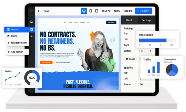
A successful website begins with a structured process. We follow a clear step-by-step approach to ensure your project moves smoothly from planning to launch while meeting performance, design, and SEO requirements. Our process follows these stages:
Every project starts with a detailed website analysis to identify strengths, gaps, and opportunities. From there, we shape a clear UX strategy that aligns with your audience's needs and business goals, ensuring the foundation is set for measurable results.


Our design phase focuses on creativity and usability. Using tools like Adobe XD, Figma, and Sketch, we craft prototypes that capture layout, navigation flow, and brand consistency. This step ensures clarity and collaboration before moving into development.


With the design approved, our developers bring the site to life using HTML5 and CSS3 along with modern frameworks. Rigorous cross-browser testing is conducted to confirm that the site looks and functions correctly on every device and platform.


Once tested and approved, the site is deployed with best practices in place. We handle SEO integration to support search visibility, conduct PageSpeed testing to maximize performance, and ensure mobile-first indexing compliance so your website stays aligned with search engine requirements.

We build responsive websites on leading platforms, optimizing for performance, scalability, and usability to drive long-term growth.

Our responsive web design services for WordPress combine SEO-friendly architecture with Gutenberg blocks and WooCommerce compatibility. We create mobile-first, easily managed sites that empower businesses to grow content and commerce with confidence.

We provide responsive web design services for Shopify that optimize checkout performance, support app integrations, and enhance store scalability. Our solutions help brands deliver seamless shopping experiences across devices while leveraging Shopify Plus and Checkout Extensibility.

Our responsive web design services for WooCommerce enable flexible, mobile-optimized online shops built on WordPress. We integrate secure payment gateways and essential extensions, giving businesses complete control to scale their ecommerce operations smoothly.

We deliver responsive web design services for Magento tailored to enterprise-level needs. From multi-store management to complex catalog rules and ERP integrations, our Magento 2 expertise ensures secure, scalable, and high-performing ecommerce platforms.

Our responsive web design services for Squarespace highlight sleek, template-driven sites with built-in ecommerce and scheduling features. Ideal for design-led businesses, we craft mobile-first websites that balance style with functionality and performance.

We offer responsive web design services for Wix that empower small businesses with rapid, mobile-ready websites. Using Wix Studio, Editor X, and Velo, we deliver flexible, scalable solutions that grow with your brand's digital needs.
"I am incredibly impressed with the outstanding service and user-friendly customer support provided by Remap"

CEO, TechCorp
"I am incredibly impressed with the outstanding service and user-friendly customer support provided by Remap"

Marketing Director, Digital Solutions
"I am incredibly impressed with the outstanding service and user-friendly customer support provided by Remap"

CTO, InnovateLab
"I am incredibly impressed with the outstanding service and user-friendly customer support provided by Remap"

Product Manager, FutureTech
"I am incredibly impressed with the outstanding service and user-friendly customer support provided by Remap"

Founder, StartupXYZ
"I am incredibly impressed with the outstanding service and user-friendly customer support provided by Remap"

Design Lead, Creative Agency
"I am incredibly impressed with the outstanding service and user-friendly customer support provided by Remap"
CEO, TechCorp
"I am incredibly impressed with the outstanding service and user-friendly customer support provided by Remap"

Marketing Director, Digital Solutions
"I am incredibly impressed with the outstanding service and user-friendly customer support provided by Remap"
CEO, TechCorp
"I am incredibly impressed with the outstanding service and user-friendly customer support provided by Remap"
Marketing Director, Digital Solutions
"I am incredibly impressed with the outstanding service and user-friendly customer support provided by Remap"
CTO, InnovateLab
"I am incredibly impressed with the outstanding service and user-friendly customer support provided by Remap"
Product Manager, FutureTech
"I am incredibly impressed with the outstanding service and user-friendly customer support provided by Remap"
Founder, StartupXYZ
"I am incredibly impressed with the outstanding service and user-friendly customer support provided by Remap"
Design Lead, Creative Agency
"I am incredibly impressed with the outstanding service and user-friendly customer support provided by Remap"
CEO, TechCorp
"I am incredibly impressed with the outstanding service and user-friendly customer support provided by Remap"
Marketing Director, Digital Solutions


Have a project in mind? Contact us for expert design and development solutions. Let's discuss how we can help grow your business.